Fort Collins Brewery will undergo a large rebrand in 2016. The updates extend to not only the artwork but some of the recipes as well.
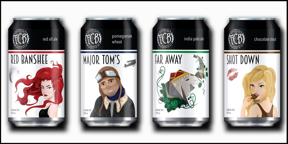
Artists local to Fort Collins Kelsey Knobel and Aubrey Inzer has been working on the brewery’s updated artwork, one of which is teased in the above artwork. The duo have attempted to bring the beer and brands to life in the artwork.
“Kelsey’s ability to capture the spirit and essence of our upcoming lineup was integral for the rebrand. Meanwhile, Aubrey was able to take those illustrations and cohesively create a look and feel that reflects who we are. She was able to come up with a minimalistic style and a retro vibe that pulls everything together” – Co-owner and general manager Tina Peters
Today the brewery has revealed branding of the brewery’s cans – Red Banshee, and Major Tom’s. Fort Collins Shot Down (Chocolate Stout) and Far Away (IPA) are both brand new releases.
The new branding will appear in spring, 2016
