Starting in February, 2015, WARSTEINER is rolling out new logos and branding in the United States. The idea is to update a refresh and modernize the more than 200 year old brewery’s look.
“Millennials are embracing WARSTEINER as their own,” said Laura Sprengard, brand manager for Warsteiner USA. “Our new, more modern look better reflects our customer base – now and into the future – without departing from the history that makes us so special.”
The breakdown on the WARSTEINER change:
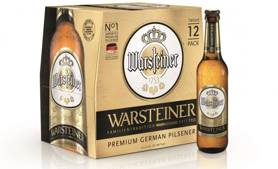
- Refreshed Logos:The WARSTEINER name features a larger, simpler font in metallic gold. Within its round logo, the typical German typeface for “s” in WARSTEINER is substituted with a new anchor in the form of the stretched “t”. The “A Queen among Beers” tag has been removed to improve legibility.
- New Name for Flagship Pilsener and Dunkel:Warsteiner’s flagship pilsener, WARSTEINER Premium Verum, is now WARSTEINER Premium German Pilsener. WARSTEINER Premium Dunkel is now WARSTEINER Dunkel.
- New Bottle Labels: The WARSTEINER Premium German Pilsenerlabel is redesigned in metallic gold and black while the WARSTEINER Dunkel label is now amber.
- New Bottle Caps:The WARSTEINER Premium German Pilsener cap switches to black while the WARSTEINER Dunkel cap changes to amber.
- New 12-Pack and 6-Pack Design:WARSTEINER Premium German Pilsener 12- and 6-packs are now gold and black while WARSTEINER Dunkel is now amber; 12-packs more clearly reveal contents. All packaging emphasizes the brand’s key differentiators – the German Purity Law of 1516 brewing tradition and its position as the No. 1 imported premium pilsener among German private breweries.
- New Pilsener Can and Package Design:WARSTEINER Premium German Pilsener cans have an updated metallic gold finish with prominent black accents. The new packaging reveals contents.
WARSTEINER opened in 1753, outside of Warstein, North-Rhine Westphalia, Germany.